Build your palette
STEP 1
Determine if your organization has brand guidelines
-
If yes, reference the colors and their hex codes
- If no, choose 2-3 foundational colors for your brand
Pro Tip: In either case, we recommend working with your Marketing, Brand, or Design team to identify 2-3 foundational colors for your dashboard.
—
—
—
STEP 2
Plan your palette
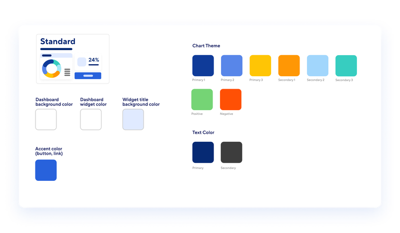
You’ll need colors for the following areas:
- Dashboard background
- Dashboard widget background
- Widget title background
- Buttons and links
- Primary and secondary text
- Base chart series values
- Semantic chart series values
—
STEP 3
Pick chart colors
These colors should work well together and be distinguishable from each other. If you need some inspiration, you can use tools like coolors.co to generate additional colors that compliment your brand's foundational colors.
Pro tip: Keep your chart colors the same all the time. If you use blue for sales and orange for marketing in one chart, always use blue for sales and orange for marketing in your other charts too.

—
STEP 4
Pick semantic chart colors
These colors should be selected with care, as they are used to represent specific data points or categories within a chart.

—
STEP 5
Pick a background color
This color sets the overall tone for your interface. It should be neutral and easy on the eyes

—
STEP 6
Pick a widget background color
The widget color should have a slight contrast with the background color for clarity and readability, or match the background color for simplicity.

—
STEP 7
Pick a widget title background color
This color is used to highlight the title areas of your widgets. It can stand out, but should not overpower the actual data within the widget.

—
STEP 8
Pick an accent color
This is a key player in your palette. It's the color used for interactive elements like buttons and links.

—
STEP 9
Pick text colors
Depending on your background color, you may need to adjust the color of your text to ensure it's easily legible.

—
STEP 10
Step 10: Review your color palette
Here’s a final check list to help you evaluate your color palette.
-
Color Differentiation: Ensure that all colors in your palette have enough contrast and clarity, particularly in visual elements like line charts. Users should be able to easily distinguish between different elements or data points.
-
Background Visibility: Make sure the chosen colors remain visible and legible when placed against a colored background.
-
Aesthetic Appeal: Step back and evaluate the overall visual harmony of your color combination. Check if the colors complement each other and create a pleasing visual experience for users.
-
Alignment with Goals: Consider whether your colors effectively convey your message and align with your aesthetic goals. Make sure the colors help users understand and interpret the data or information presented to them.
-
Accessibility and Inclusivity: Use tools like Coblis to ensure that the color palette you’ve selected is accessible to individuals with color vision deficiencies — the colors should be distinct and clear for all users.
- Brand Identity: Check whether the chosen colors are consistent with your brand's visual identity and guidelines, if applicable, to establish a cohesive and recognizable brand presence.